Shot Analysis: Spike Jonze's Adaptation
I’m currently learning and discovering more about the film medium. One of the more interesting realizations I’ve had in the process is just how much attention goes into constructing individual shots. Before I had assumed that much of this was set design and making sure actors were positioned such that the viewer could always suss out the action in the scene without much trouble. I’ve since learned, both through reading and actually practicing with setting up my own shots, how integral the shot construction is to the narrative, and how technically difficult it is to execute when you’re behind the camera.
As an exercise, I’m applying my rudimentary knowledge of the shot/narrative interaction towards the films I watch. The first film I looked at was Adaptation (2002), directed by Spike Jonze. The zany concept of the film aside - real-life Adaptation screenwriter Charlie Kaufman writes a script about his own attempts to adapt a book into a feature film, wherein his character eventually decides to instead turn the script into a story chronicling his own inability to adapt the book - the film ultimately relies on its portrayal of the shifting emotional and psychological states of the primary characters. There is Charlie Kaufman, screenwriter (played by Nicolas Cage), who lives with his twin brother Donald (also played by Nicolas Cage), also an aspiring screenwriter. Charlie’s failures as he tries to adapt the book The Orchid Thief into a movie are paralleled by his naïve brother’s immediate success with a cliché Hollywood script that Charlie disdains. The film also focuses on the writer of The Orchid Thief, Susan Orlean (played by Meryl Streep), and her relationship with the inspiration for her book, the eccentric yet intellectual orchid poacher John Laroche (Chris Cooper).
The cinematography and direction of the film really work at communicating both the relationships between characters and their individual psychologies. The effect is we, the viewers, can trace the path of Charlie, struggling with his adaptation, or Susan, working to reconcile the two lives she has been living since meeting Laroche, with greater ease because we are being led with a skilled hand.
To examine this in detail, it’s helpful to begin with a study on how the film portrays the psychology if its main characters, as it arms us with knowledge about the character that will aid the reading of more subtle shots focusing on comparing or contrasting characters.
Character Psychology
Since Charlie Kaufman is the main protagonist, he is the focus of the majority of shots that focus on communicating psychology. Early on in the film, we see Charlie at a party with a woman named Amelia who he seems to be in a relationship with. Instead of talking with the rest of the ebullient party guests, the two are secluded up the stairs in an alcove. Charlie’s discomfort, both with the party and with Amelia, is clear when we see an over-the-shoulder (OTS) shot of their conversation.
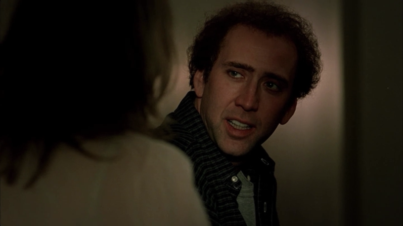
Charlie’s face is framed tightly and is visually constricted, as Amelia’s shoulder appears to be forcing him into a corner. Much of his face is also hidden in shadow (a convention that we will see many times throughout the film), adding to the sense that Charlie is insecure, or ashamed of himself, and prefers to avoid attention (or perhaps thinks he doesn’t deserve it). We are free to imagine the specific implications, but the shot puts us in the right frame of mind: Charlie is not comfortable with where he is. Besides giving us insight into his psyche, this shot also works to foreshadow the dissolving of Charlie’s relationship with Amelia (due to his inability to react to her advances) further in the film.
Charlie’s self-worth is examined further in shots of him lying in bed. After a romantic fantasy sequence with Charlie and his producer, the film cuts to Charlie alone in his room and we discover he was masturbating.
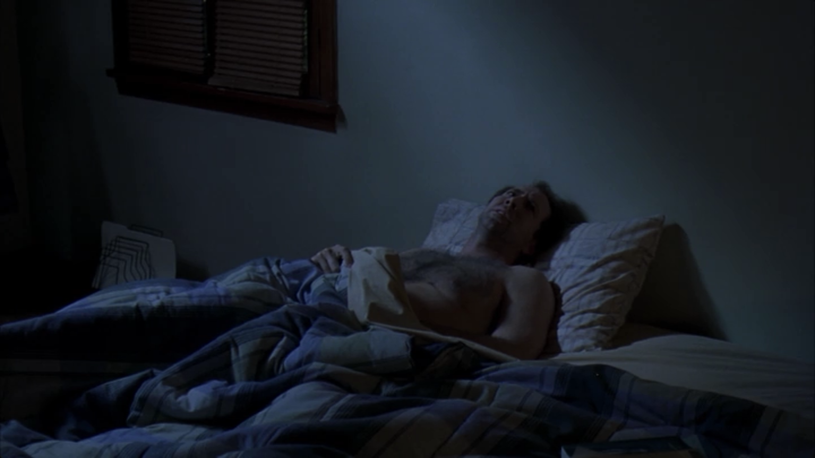
While the bed is normally an intimate place, here Jonze chose to pull back and emphasize the amount of space and emptiness around Charlie. Lighting also plays an integral role here - the cold light of the room is a sobering reminder that Charlie is nowhere near his fantasy. He is alone, almost without any color or vibrancy. The shot is also positioned so we are looking down on his frame, a classic technique to illustrate a character’s lack of power. All of these details add to the overall sense of failure that Charlie is dealing with as he tries to come up with a screenplay.
There are a few comedic moments in the film that contrasts the initial manic energy of Charlie’s creative brainstorming with the depressed self-doubt that comes when he revisits the results later. In this sequence, Charlie excitedly talks about all of his ideas for how to open his movie, then cuts to him playing back his recorded ramblings later.
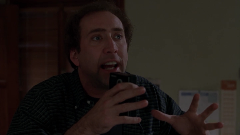
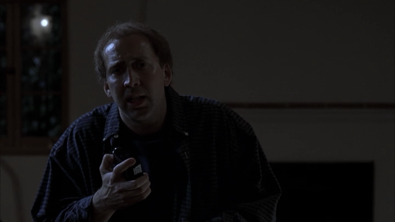
Much of the comedic effect in this moment comes from the drastic differences in how Charlie is shown. In the first shot, he is close to the camera and placed in the center of the frame. He has a fair amount of light on his face, and the camera is positioned slightly below him, putting him in a position of confidence and power. In a jarring contast, the next shot shows Charlie further away from the camera (again, emphasizing the emptiness around him), largely washed out due to all the shadow, and his placement is off-center. Additionally, he has less headroom in the second shot and doesn’t fill the frame - his initial energy is depleted and is replaced by a combination of horror and despair as he comprehends how hopeless his situation is. Even if Nicolas Cage wasn’t slumped over and visibly forlorn in this shot, we would still get that impression just through the impact of the contrast with the previous shot.
As Charlie continues, with difficulty, to “find the story” in The Orchid Thief, we get a shot of him that reinforces how challenging this task is.
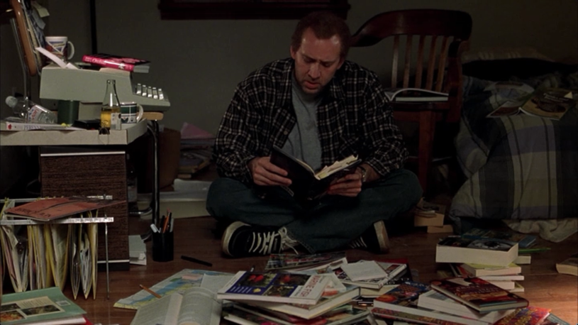
This is a good example of both framing and careful construction of detail. While Charlie’s room could be filled with lots of different objects, all we really see are books and his typewriter workstation. The homogeny of objects prevents us from trying to read all the individual items in the scene, and instead we have the general impression of disorder. Notice how Charlie is also hunched down and takes up a small amount of space relative to the frame. This allows him to be visually overwhelmed and penned-in by all the materials surrounding him. The piles of books and reference materials surround him almost like a circle of wagons, while his typewriter threatens his position from the left. We are left with the impression of Charlie overwhelmed entirely by his screenplay, and without escape - where is he supposed to move?
Another comedic brainstorm sequence happens later in the film, where Charlie decides that perhaps the solution to his plight is to make the film about his plight. He elatedly starts narrating ideas into his voice recorder again, but is later sieged by more feelings of doubt, wondering how narcissitic he is to make the movie revolve around him instead of the book. Then, Donald enters with the news that his first screenplay (that Charlie derides as sophomoric) was picked up by a studio.
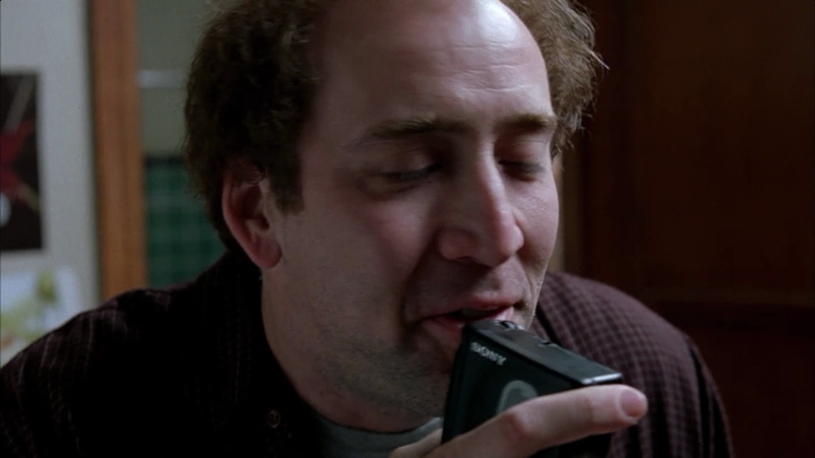
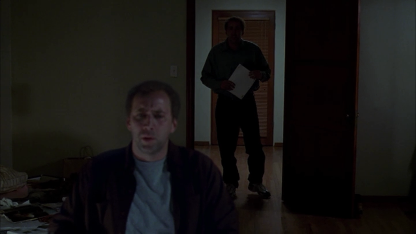
This sequence uses many of the same techniques as the first brainstorm sequence, which actually helps the comedy. At first Charlie is well-lit and dominant, finally he is shadowy and dwarfed. We as the audience have seen this before, and already know how it turns out before it happens. We are therefore left waiting for the punchline from the beginning, which makes it even funnier when Jonze repurposes a convention from the horror/thriller to bring Donald into the scene as a looming silhouette clutching his successful screenplay: it is Charlie’s worst nightmare - that he will fail where his brother succeeds - coming to haunt him. The deliberate choice to make this scene so visually similar to the earlier brainstorm scene functions not only comedically but also thematically: we seem to know, even before Charlie, that until he changes some of his attitudes and loosens some of the pressure he places on himself to be truly original - he will never have his story.
Eventually Charlie decides, with much hesitation, to take some advice from Donald and talk with Susan, the author, in an attempt to find more material for his screenplay. When he goes to visit her office at The New Yorker, he encounters her by chance in the elevator, but is unable to talk with her before she leaves.
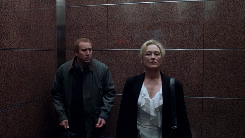
Both Charlie and Susan are given lots of headroom here, which actually serves two different purposes for each character. For Charlie, it emphasizes how small and pathetic he feels that he’s actually here trying to rescue his screenplay by talking with Susan. For Susan, it provides a contrast to the powerful presence she normally puts forth as a reporter. Although she may try to act one way, she has many inner doubts about her life and the direction it has taken. The empty space of the elevator weighs heavily upon both characters, and visually surrounds them; the horizontal lines of the elevator chamber help emphasize the scale of this vertical space. The characters are also separated just enough to be not touching, adding to the feeling of isolation for each. In addition to the physical separation, there is a sense of great depth in between Charlie and Susan (aided by a wide-angle lens). We are left with the impression that he has to cross a great distance to initiate conversation with her. Also notice that Charlie is once again positioned in a corner. His uncomfortable position and proximity from Susan emphasizes and illustrates the paralyzation he is experiencing from his case of writer’s block.
For a final examination of a shot that conveys information about a character’s psychology, we can look at a pivotal scene for Susan, where we discover more about the nature of her relationship with Laroche. She sits alone in a hotel room with a package of drugs (derived from orchids) that, it is revealed, she asked Laroche to procure. As she takes the drugs, she transforms, and we see how different her external persona is from her inner desires.
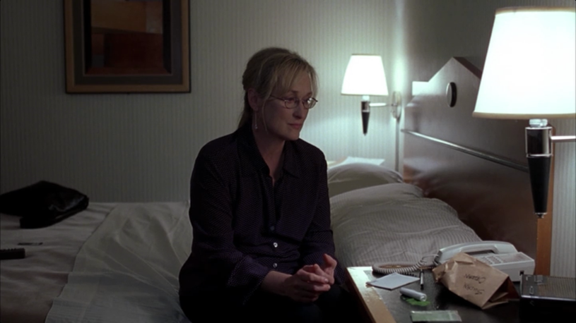
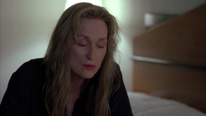
In the first shot Susan is positioned center-frame, as she often is in the film. However, while her centered position normally conveys dominance and confidence, in this shot it serves to emphasize her hesitation and nervousness. The overall brightness of the scene swallows her up. She is dressed in dark colors and is positioned lower in the frame so the room fills in space all around her. The sparseness of the room accentuates the professional sterility that she exhibits throughout most of the film. Once she inhales the drugs, however, it’s a different story. Jonze uses a close-up shot, de-emphasizing the room and bringing our attention on her as she completes her transformation - we are free to focus more on her difference of appearance. Her hair is down, her glasses are removed - she is both more vulnerable and perhaps more comfortable than before. In the close-up she is slightly off-center, drifting a bit from her position of power as she lets herself feel whatever is it the drug is making her feel. However, she is also bathed in the light from the lamp in the corner, a soft glow that evokes warmth and comfort.
Overall, these shots support the underlying narrative of Adaptation by chronicling the various emotional states of the main characters at each point in the narrative. However, because these shots focus on one character’s inner psychological state, they typically only involve one character at a time. For scenes where action is taking place between two or more characters, there are different dynamics at play. Dialog scenes often contain a lot of characterization, and Adaptation features many scenes between two characters that reveal much about the players or themes through comparison and contrast. The construction of the shots in these scenes therefore serves to invite these comparisons - and there are plenty of examples to look at throughout this film.
Characterization through Compare/Contrast
One of the more interesting character dynamics in Adaptation is between Donald and Charlie. While Charlie is self-loathing, anxious, and teeters between mania and depression, Donald is calm, confident, and genial. In the beginning of the film, Charlie is clearly the more successful brother from an outside perspective - coming off the success of his screenplay for Being John Malkovitch, he’s working to maintain his upward trajectory and live up to the “genius” label others have placed on him. Donald is a kind of lovable fuckup who hasn’t found any real success and decides to try screenwriting. While Donald is the more put-together emotionally, he looks up to Charlie to the point of reverence and tolerates Charlie’s harsh criticism of his work.
The power balance between Donald and Charlie is embodied physically in most scenes that contain the two brothers. Donald is consistently shown in a position substantially lower than Charlie, and has to look up to Charlie when they speak. This sustained contrast at times comes across as a sight gag, where Donald appears to be lying around everywhere.
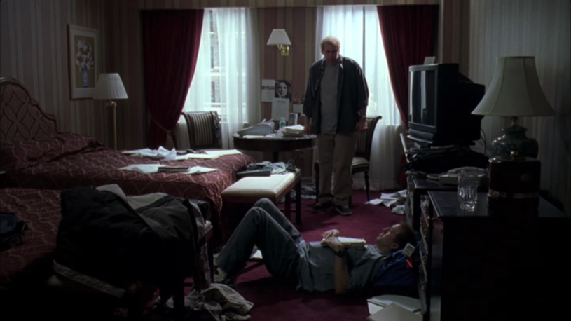
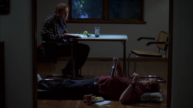
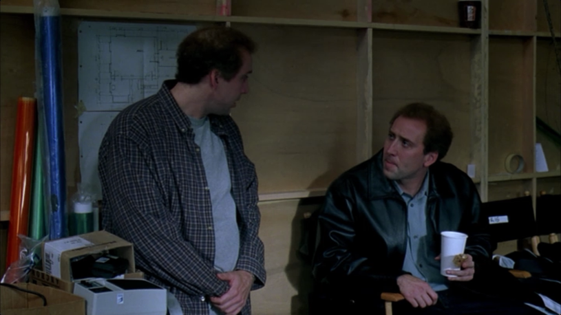
Adaptation gets away with this partly because of a plot device (Donald has a bad back and needs to lie down), but also because it works to enforce the paradox of Donald’s implied inferiority: though he looks up to Charlie and Charlie conversely dismisses much of Donald’s creative contributions, it is actually Donald who finds success with greater ease in the story. His first screenplay is selected for production by a studio, he becomes friends with an actress from Being John Malkovitch that Charlie never received attention from, and his relationships with women blossom while Charlie’s founder. The deliberate framing of the shots with Donald and Charlie serve to amplify the inner conflict that Charlie feels regarding his creativity. Charlie sees in Donald the success that he could have if only he compromised his drive to be original and unique (by rejecting all convention), yet he can’t bring himself to come down to Donald’s level.
Another example of using framing to portray power dynamics are in the first scene where we are introduced to John Laroche. Laroche has just returned from the swamp where he was harvesting orchids with his Seminole crew when a sheriff spots their truck and catches them. Laroche is completely nonplussed by the presence of authority, and the composition of the frames both characters inhabit reinforces this.
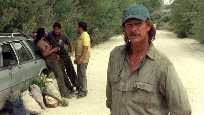
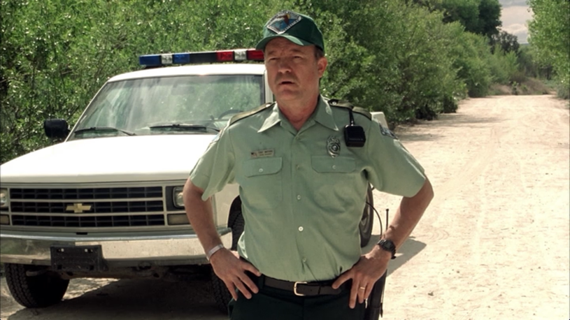
Laroche appears in the right third of the frame, his head on a focal point in the upper-right corner. He is standing directly in the path of the road, implying an unwillingness to yield to the sheriff. The sheriff, on the other hand, stands in the center of the frame. Though he is in a dominant position, front and center with the camera pointed slightly up at him, the shot is constructed to undermine his position of power. The road behind him is noticeably wide open (the bright sun on the dusty road helps make this more prevalent), and the camera is pulled back to show less of him, making his presence less intimidating than otherwise. From this brief interchange, Laroche comes across as confident, with a distaste for those who try to exert power over him.
In another example, we see a conversation Charlie has in his agent’s office, where he tries to get out of writing his screenplay. While framing is indeed a factor in this shot, there is also a lot of attention paid to the set to really contrast the agent, who represents the business side of Charlie’s craft, and Charlie.
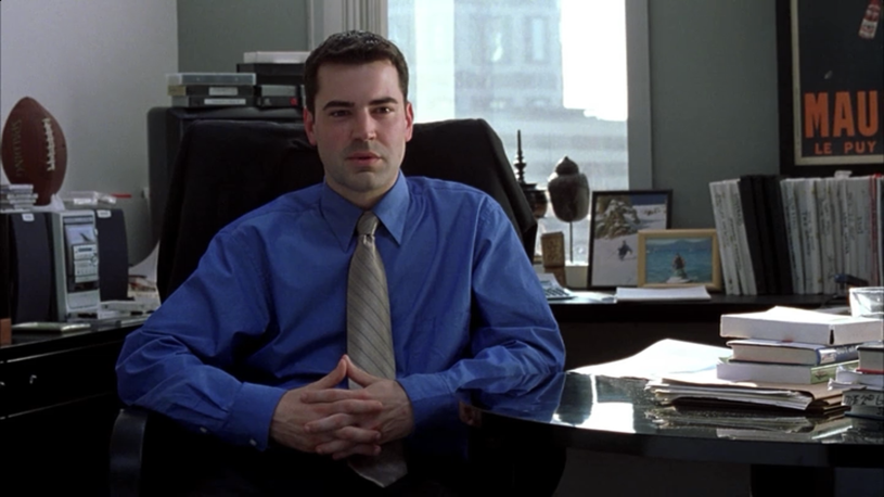
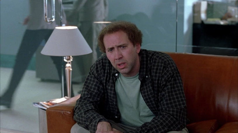
Notice all of the details in the shot of the agent. In many ways he is set up to be a visual foil to Charlie. His shirt is crisp and bold and includes a tie; Charlie’s unbuttoned flannel looks sloppy. The agent has a football and photos of himself (presumably) snowboarding and jetskiing. It is hard to imagine Charlie doing either of these things. The shot of the agent also includes a window, through which we can see more high-rise buildings and symbols of business. Behind Charlie we mostly see the floor. The vertical camera placement does play a role in this set of shots, similar to the Laroche/sheriff scene. The camera seems just slightly below the agent, making him appear in control and confident, while Charlie is placed below the camera so we look down on him as he admits defeat, trying to be released from his project.
While many of the scenes Charlie is in focus on portraying how at odds he is with his environment and the people around him, there are times when he is visually compared to another character, to provide insight about both. A good example of this is a match-cut leading in to Susan’s hotel scene. As Charlie sites on his bed, despondent and feeling helpless, the next shot is of Susan, in a similar position and with a similar lighting treament.
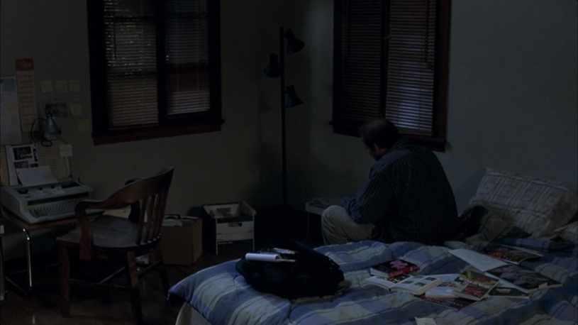
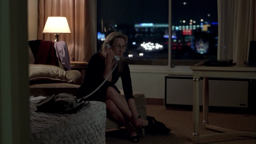
Notice the similarities between the two shots. Both are taken slightly from above (Charlie’s is from a more extreme angle), both contain lots of headroom on the characters that emphasize their crouched postures, and both cloak the characters primarily in shadow. The visual continuity serves to equivocate the mental state of both characters, one of whom - Susan - has up to this point been shown as confident and in control. By comparing her situation to Charlie’s, we are invited to believe that she is suffering from a similar internal conflict. In Susan’s case, we have less of an idea as a viewer what is going on, but we know to start looking and discovering for ourselves.
It’s In the Details
In taking a closer look at this film, I became more aware of how I respond to scenes in films as a whole. The subtle visual cues with positioning, lighting, or even lens choice all serve to crystallize the narrative in a well-shot film. We have been conditioned over hours and hours of watching movies and television to pick up on cues, and by understanding exactly how to manipulate the presentation of a shot to present cues to a viewer, a filmmaker can elicit an emotional response appropriate for the narrative they are trying to communicate. It is important to note that this post only covers (a small set of) the visual choices a director or cinematographer can make. Audio and sound design, acting, and writing all of course play a role in how the audience reacts to a film. I would simply encourage you to spend a bit of time the next time you’re enjoying a movie to think a bit about the choices the director has made - because, they are choices, and they all have a purpose, even if small.